Role: UX Researcher & Graduate Assistant
Timeline: Aug 2021 – May 2022
Team: Collaborated with Senior EHS Staff & HR
Methods: Usability Testing, Heuristic Evaluation, Information Architecture (IA) Redesign, Database Optimization (SQL)
Executive Summary
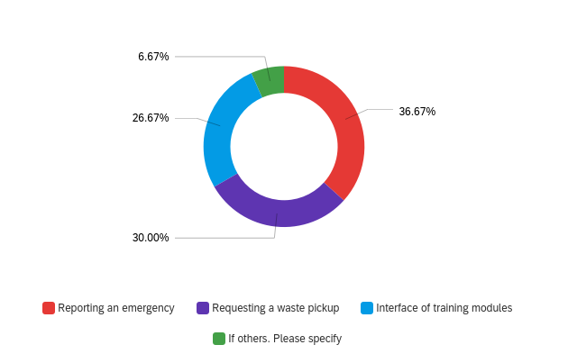
Challenge: The Environmental Health and Safety (EHS) department is responsible for the safety of thousands of researchers and staff at LSU. However, the existing digital portal suffered from dense navigation. Discovery research revealed that 36.67% of user pain points were related specifically to reporting emergencies.
Approach: I conducted a comprehensive usability audit with key personas, including Lab Assistants and Student Workers. Moving beyond surface-level design, I mapped critical user journeys and restructured the site’s architecture to prioritize high-stress tasks.ent strategy.
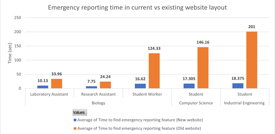
Outcome: The redesign streamlined the mandatory training workflows and digitized record-keeping into a structured database. Additionally, The emergency reporting workflow. Usability testing confirmed an 87% reduction in average Time-on-Task across all user groups (dropping from ~106 seconds to ~14 seconds), ensuring rapid access during crises.
Context: High-Stakes UX
Safety Problem: In an industrial or laboratory setting, a website isn’t just a brochure; it’s a tool for survival. If a Chemistry student cannot find the “Chemical Spill Protocol” in under 30 seconds, it poses a safety risk. My initial analysis revealed that critical safety info was buried under administrative jargon.
Operational Problem: Behind the scenes, the record-keeping system for invoices and training records was inefficient. Manual processes slowed down the department’s ability to audit labs and verify compliance.
Research & Discovery
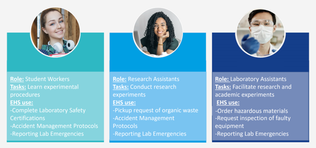
Defining the Users: We identified three primary personas who interact with the portal under different stress levels.
- Student Workers: High turnover, low familiarity. They need the simplest interface.
- Research Assistants: Moderate familiarity. They handle organic waste and accidents.
- Lab Assistants: High familiarity. They order materials and request inspections.
Identifying the Bottlenecks: A survey of user needs revealed the most critical friction points. Surprisingly, Reporting an Emergency was the top issue (36.67%), surpassing even daily tasks like waste pickup (30%) and training modules (26.67%)
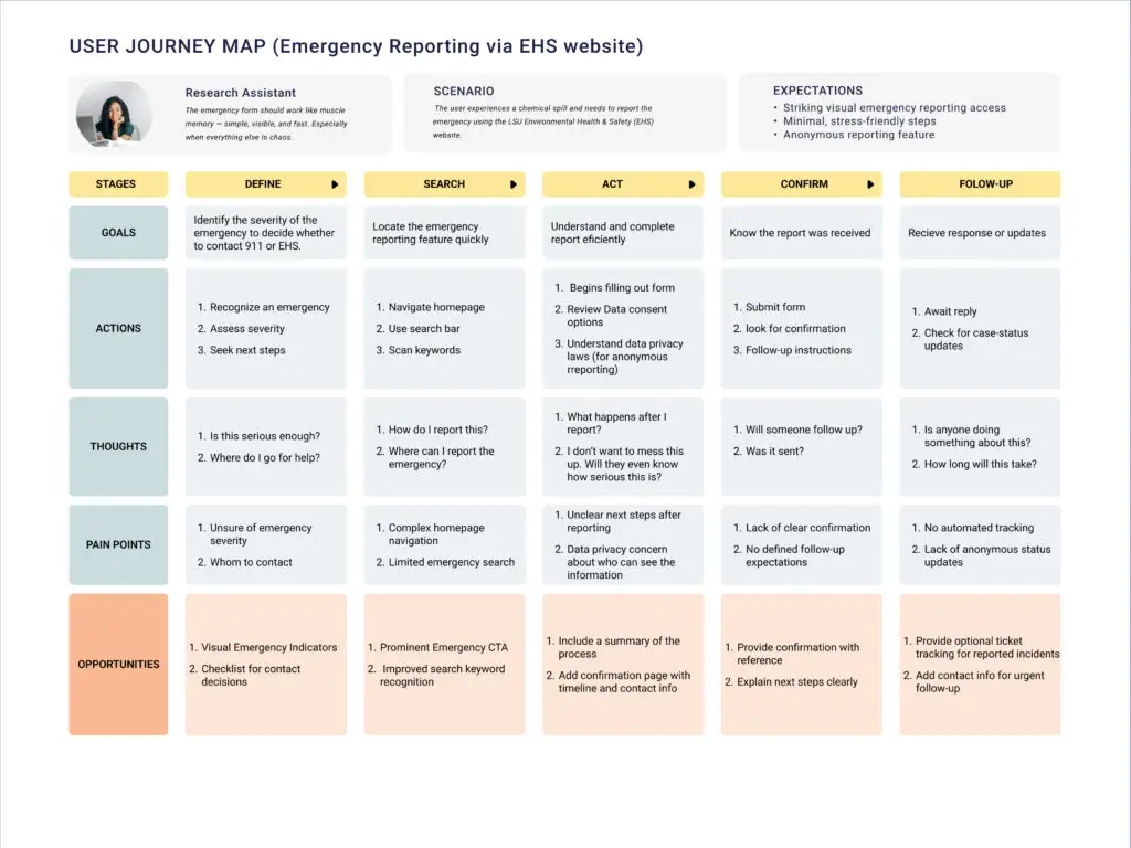
The Safety Journey
The “High-Stakes” Scenario In an industrial or laboratory setting, a website isn’t just a brochure; it’s a tool for survival. I mapped the user journey for a “Chemical Spill” scenario to understand the emotional and cognitive load during an emergency. The analysis revealed that users often hesitated during the “Search” and “Act” phases due to complex navigation.
Redesign Strategy: Simplifying the Path
Information Architecture (IA) Overhaul The existing website forced users through a “spaghetti” web of links to find forms. I prototyped a linear flow that reduced decision fatigue.
- Before: Users navigated multiple nested menus to find the right PDF.
- After: A linear, 3-step digital workflow (Select Incident -> Fill Details -> Confirmation).
- Compared LSU’s EHS site to those at peer institutions (e.g., Harvard, Johns Hopkins University, etc.) to identify best practices.
- Developed user personas: student workers, research assistants, and lab assistants, all with diverse digital fluency and device contexts.
Current website:

Prototype website:

Impact:
The most significant win was the reduction in Time-on-Task for emergency reporting. In a crisis, seconds matter.
- Overall Improvement: Reduced average reporting time by 87% (from ~106s to ~14s).
- Student Workers: Improved from 124.33s to 16.62s.
- Lab Assistants: Even experienced users saw improvement, dropping from 33.96s to 10.13s.